

In this post, I will focus on gradients of image signals defined on grids in computer graphics and image processing. Specifically, gradients / derivatives of images, height fields, distance fields, when they are represented as discrete, uniform grids of pixels or voxels.
I’ll start with the very basics – what do we typically mean by gradients (as it’s not always “standardized”), what are they used for, what are the ypical methods (forward or central differences), their cons and problems, and then proceed to discuss an interesting alternative with very nice properties – diagonal gradients.
My post will conclude with advice on how to use them in practice in a simple useful scheme, how to extend it with a little bit of computations to a super useful concept of a structure tensor that can characterize dominating direction of any gradient field, and finish with some signal processing fun – frequency domain analysis of forward and central differences.
Image gradients
What are image gradients or derivatives? How do you define gradients on a grid?
It’s not very well defined problem on discrete signals, but the most common and useful way to think about it is inspired by signal processing and the idea of sampling:
Assuming there was some continuous signal that got discretized, what would be the partial derivative with regards to the spatial dimension of this continuous signal at gradient evaluation points?
This interpretation is useful both for computer graphics (where we might have discretized descriptions of continuous surfaces; like voxel fields, heightmaps, or distance fields), as well as in image processing (where we often assume that images are “natural images” that got photographed).
Continuous gradients and derivatives used for things like normals of procedural SDFs are also interesting, but a different story. I will not cover those here, and instead recommend you check out this cool post by Inigo Quilez with lots of practical tricks (re-reading it I learned about the tetrahedron trick) and advice. I am sure that no matter your level of familiarity with the topic, you will learn something new.
In my post, I will focus on computer graphics, image processing, and basic signal processing takes on the problem. There are two much deeper connections that I haven’t personally worked too much with. So I leave it as something that I wish I can expand my knowledge in the future, but also encourage my readers to explore it:
Further reading one: The first connection is with Partial Differential Equations and their discretization. Solving PDEs and solving discretized PDEs is something that many specialized scientific domains deal with, and computing gradients is an inherent part of numerical discretized PDE solutions. I don’t know too much about those, but I’m sure literature covers this in much detail.
Further reading two: The second connection is wavelets, filter banks, and the frequency precision / localization trade-off. This is something used in communication theory, electrical engineering, radar systems, audio systems, and many more. While I read and am familiar with some theory, I haven’t found too many practical uses of wavelets (other than the simplest Gabor ones or in use for image pyramids) in my work, so again I’ll just recommend you some more specialized reading.
Applications
Ok, why would we want to compute gradients? Two common uses:
Compute surface normals – when we have something like a scalar field – whether distance field describing an underlying implicit surface, or simply a height field, we might want to compute its gradients to compute normals of the surface, or of the heightfield for normal mapping, evaluating BRDFs and lighting etc. Maybe even for physical simulation, collision, or animation on terrain!
Find edges, discontinuities, corners, and image features – the other application that I will focus much more on is simply finding image features like edges, corners, regions of “detail” or texture; areas where signal changes and becomes more “interesting”. The human visual system is actually built from many edge detectors and local differentiators and can be thought of as a multi-scale spatiotemporal gradient analyzer! This is biologically motivated – when signal changes in space or time, it means it’s a potential point of interest or a threat.
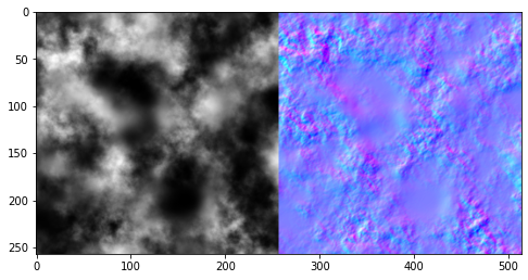
The bonus use-case of just computing the gradients is finding the orientation and description of those features. This is bread and butter of any image processing, but also very common in computer graphics – from morphological anti-aliasing, selectively super-sampling only edges, or special effects. I will go back to it in the description of local features in the Structure Tensor section, but for now let’s use the most common application – just using the gradient vector magnitude, used for example in the Sobel operator: 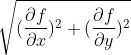

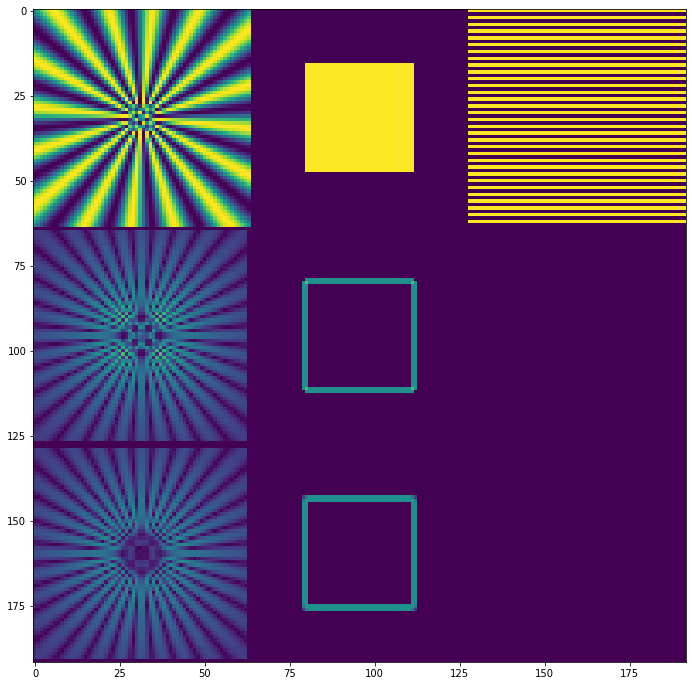
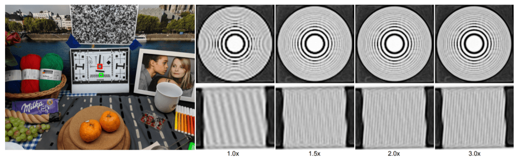
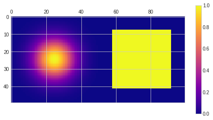
Test signals
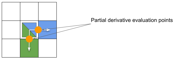
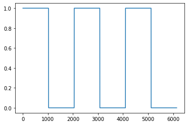
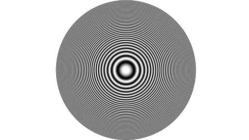
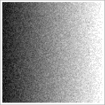
I will be testing gradients on three test images:
- Siemens star – a test pattern useful to test different “angles” and different frequencies,
- A simple box – has corners that can immediately show problems,
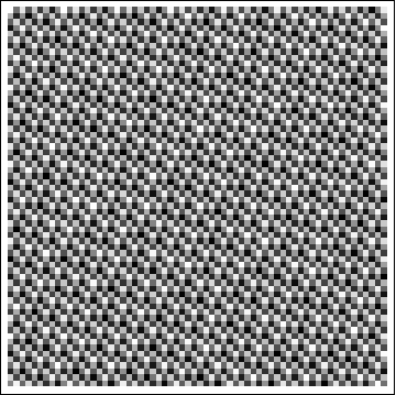
- 1 0 1 0 stripe pattern – frequencies exactly at Nyquist.

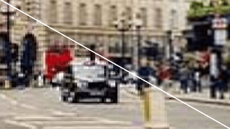
The Siemens star was rendered at 16x resolution and downsampled with a sharp antialiasing filter (windowed sinc). There is some aliasing in the center, but it’s ok for our use-case (we want to see a sharp signal change there and then detect it).
Forward differences
The first, most intuitive approach is computing forward difference.
This is an approximation of by computing f(x+1) – f(x).
What I love about this solution is that it is both intuitive, naive, as well as theoretically motivated! I don’t want to rephrase the wikipedia and most of readers of my blog don’t care so much for formal proofs, so feel free to have a look there, or in specialized courses (side note: 2010s+ are amazing, with so many best professors sharing their course slides openly on the internet…). It’s basically built around the Taylor expansion of the f(x+1) – f(x).
This difference operator is the same as convolving the image with a [-1, 1] filter.
It’s easy, works reasonably well, is useful. But there are two bigger problems.
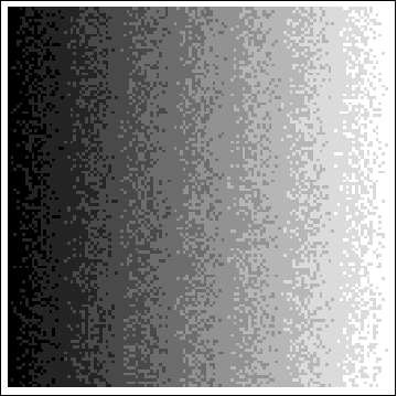
Problem 1 – even-shift
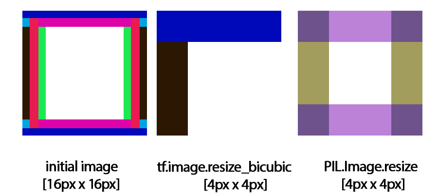
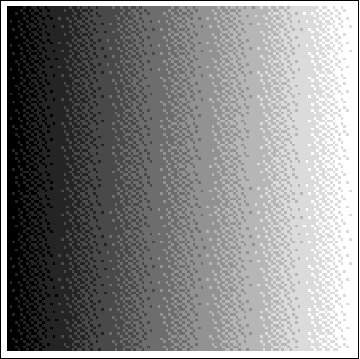
If you have read my previous blog post – on bilinear down/upsampling – one of challenges might be visible right away. Convolving with an even-sized filter, shifts the whole image by a half a pixel.
It’s easily visible as well:

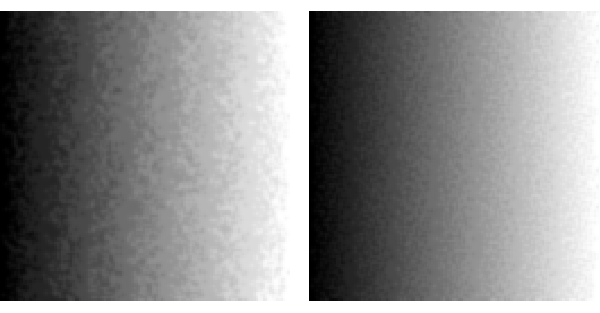
Depending on the application, this can be a problem or not. “A solution” is simple – undo it with another even sized filter. Perfect solution would be resampling, but resampling by a half pixel is surprisingly challenging (see my another blog post), so instead we can blur it with a symmetric filter. Blurring the gradient magnitude fixes it (at the cost of blur):

Blurring with an even sized filter fixes the even sized shift. But one other problem might have became much more visible right now.
Note: You might wonder, what would happen if we would blur just the partial differences instead? We will see in a second.
But let’s focus on another, more serious problem.
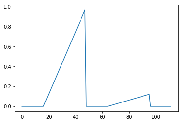
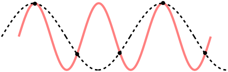
Problem 2 – different gradient positions for partial differences
Second problem is more severe; what happens if we compute multiple partial derivatives; like df/dx and df/dy this way?
Partial derivatives are approximated at different positions!
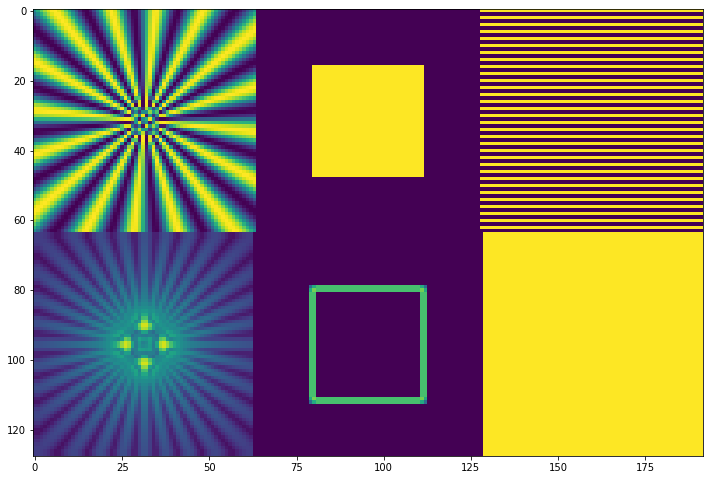
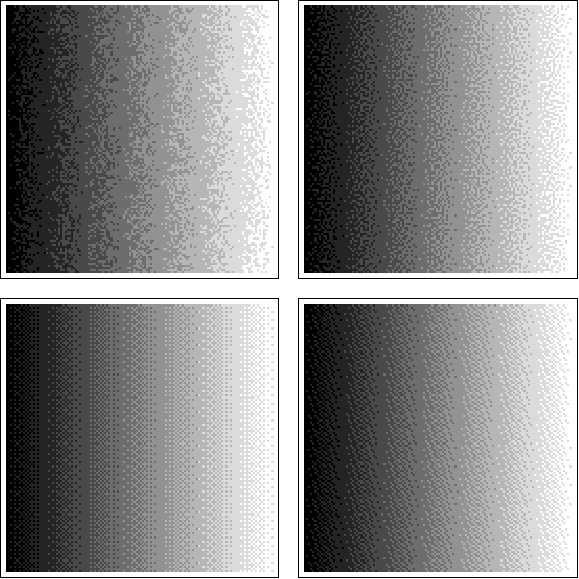
Now let’s have a look at the same plot again, this time focusing on “symmetry”. This shows why it’s a real, not just theoretical issue. If we look at gradients of a Siemens star and the box, we can see some asymmetry:

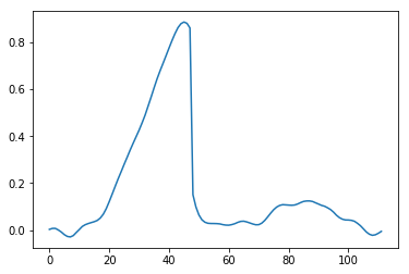
This is definitely not good and will cause problems in image processing or computing normals, but it’s even worse if we look at the gradient magnitude of a simple “square” in the center of the image – notice what happens to the image corners, one corner is cut off, and another one 2x too intense!
This is a big problem for any real application. We need to look at better approximations.
Central differences
I mentioned that “blurring” partial derivatives can “recenter” them, right? What if I told you that it is also numerically more accurate? This is the so-called central difference.
It is evaluated by ![]() . The division by two is important and intuitively can be understood as dividing by the distance between the pixels, or the differential dx, where dx is 2x larger.
. The division by two is important and intuitively can be understood as dividing by the distance between the pixels, or the differential dx, where dx is 2x larger.
When forward difference was an approximation accurate to the O(h), this one is more accurate, to O(h^2). I won’t explain those terms here, but the wikipedia has some basic intro, and in numerical methods literature you can find a more detailed explanation.
It is also equivalent to “blurring” the forward difference with a [0.5, 0.5] filter! [0.5, 0.5] o [-1, 1] leads to [-0.5, 0, 0.5]. I was initially very surprised by this connection – of a more accurate, theoretically motivated Taylor expansion, and just “some random ad-hoc practical blur”. This is even sized blur, so this also fixes the half pixel shift problem and centers both partial derivatives correctly:

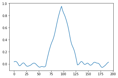
Problem – missing center…
However, there is another problem. Notice how the gradient estimate on the pixel doesn’t take pixel’s value into account at all! This means that patterns like 0 1 0 1 0 1 will have… zero gradient!
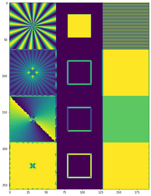
This is how both methods compare on all gradients, including the “striped” pattern:
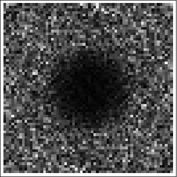
The central difference predicts zero gradient for any 1 0 1 0-like, highest frequency (Nyquist) sequence! On Siemens star it demonstrates as missing / zero gradients just outside of the center.
We know that we have strong gradients there, and strong patterns/edges, so this is clearly not right.
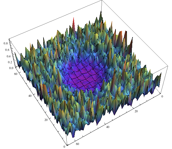
This can and will lead to some serious problems. If we look at the Siemens star, we can notice how it is nicely symmetric, but misses gradient information in the center…
Sobel filter
It’s worth mentioning here what is the commonly used Sobel filter. Sobel filter is nothing more or less than central difference that is blurred (with a binomial filter approximation of Gaussian) in the direction perpendicular to evaluated gradient, so something like:

The practical motivation for it in Sobel filter is a) filtering out some noise and tendency to be sensitive to single pixel gradients that are not very visible, and more importantly b) its blurring introduces more “isotropic” behavior (you will see below how “diagonals” and “corners” are closer magnitude to the horizontal/vertical edges).
Sobel operator would compare to the central difference (comparing those due to the largest similarity):
Does the isotropic and fully rotationally symmetric behavior matter?
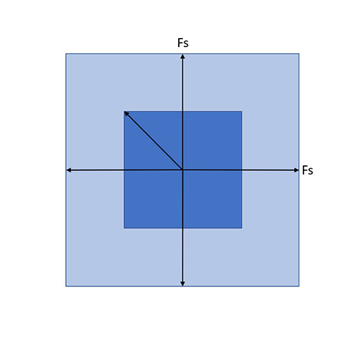
Mentioning isotropic or anisotropic response on grids is always weird to me. Why? Because the Nyquist frequencies are not isotropic or radial, they form a box. This means that we can represent higher frequencies on the diagonals than the principal axes. I have covered in an older post of mine how this property can be used in checkerboard rendering by rotating the sample grid (used for example in many Playstation 4 Pro to achieve 4K rendering with spatiotemporal upsampling). But any analysis becomes “weird” and I often see discussions of whether separable sinc is “the best” filter for images, as opposed to rotationally symmetric jinc.
I don’t have an easy answer for how important it is for the image gradients, and the question is “it depends”. Do you care about detecting higher frequency diagonal gradient as stronger gradients or not? What’s the use-case? I haven’t thought about it in the context of normal mapping, as this could lead to “weird” curvatures, but I’m not sure. I might come back to it out of personal curiosity at some point, so please let me know in the comments what are your thoughts and/or experiences.
Image Laplacians
Edit: Jeremy Cowles suggested an interesting topic to add here and an area of common confusion. Sobel operator can be sometimes used interchangeably / confused with Laplace operator. Laplace operator can be discretized like:
Both can be used for detecting the edges, but it’s very important to distinguish the two. Laplace operator is a scalar value corresponding to the sum of second order derivatives. It measures a very different physical property and has a different meaning – it measures smoothness of the signal. This means that for example a linear gradient will have a Laplacian of exactly zero! It can be very useful in image processing and computer graphics, and sometimes even better than the gradient; but it’s important to think what you are measuring and why!
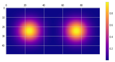
Laplace operator is signed, but its absolute value on our test signals looks like:

So despite being centered it doesn’t have problem of vanishing 0 1 0 1 0 sequence – great! On the other hand notice how it’s almost zero outside of the Siemens star center, and stronger in the center and on the corners – very different semantic meaning and practical applications.
Larger stencils?
Notice that as you can use the central difference for increase of the accuracy of the forward difference / higher order approximation, you can go even further and further, adding more taps to your derivative-approximating filter!
They can help with disappearing high frequency gradients, but your gradients become less and less localized in space. This is the connection to wavelets, audio, STFT and other areas that I mentioned.
I also like to think of it intuitively as half pixel resampling of the [-1, 1] filter. 🙂 For example if you were to resample [-1, 1] with a half pixel shifting larger sinc filter, you’d get similar behavior:

Diagonal differences
With all this background, it’s finally time for the main suggestion of the post.
This is something I have learned from my coworkers who worked on the BLADE project (approximating image operations with discrete learned filters), and then we used in our work that materialized as the Handheld Multiframe Super-Resolution paper and Super-Res Zoom Pixel 3 project that I had a pleasure of leading.
I get a lot of questions about this part of the paper in some emails as well, so I think it’s not a very commonly known “trick”. If you know where it might have originated and domains that use it more often, please let me know.
Edit: Don Williamson has noticed on twitter that it’s known as Robert’s Cross and was developed in 1963!
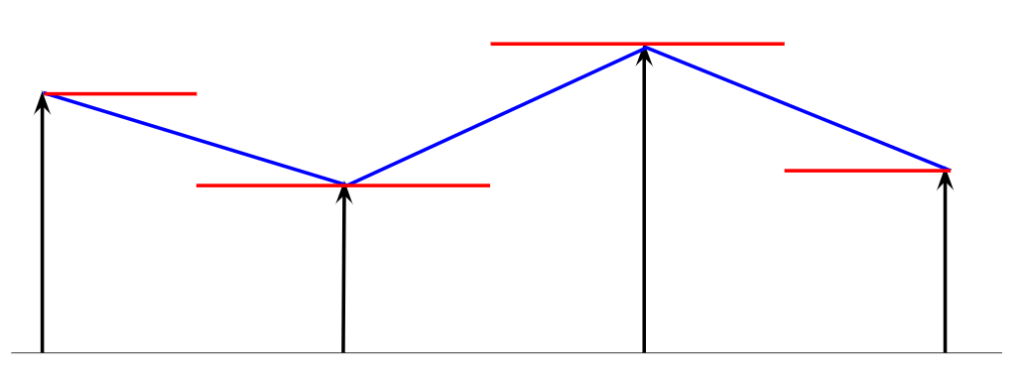
The idea here is to compute gradients on the diagonals. For example in 2D (note that it extends to higher dimensions!):

We can see that with the diagonal difference, both partial derivative approximations are centered in the same point. We compute those just like forward differences, but need to compensate for larger distance, sqrt(2), size of the diagonal of the pixels, so and
.
If you use gradients like this you can “rotate it” for normals. For just gradient magnitude you don’t need to do anything special, it’s computed the same way (length of the vector)!
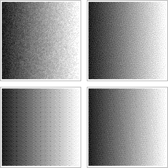
Gradient computed like this doesn’t have missing high frequency gradients problems; nor asymmetry problems:

It has the problem of pixel shift, and some anisotropy, but the pixel shift can be easily fixed.
Diagonal differences – fixing shift in a 3×3 pixel window
In a 3×3 window, we can compute our gradients like this:
This means sum all the squared gradients, and divide by 4 (number of gradient pairs) – all very efficient operations. Then you just take the square root and get the gradient magnitude.
This fixes the problem of phase shift and IMO is the best of all alternatives discussed so far:
Diagonal differences detect high frequencies properly, don’t have a pixel shift problem, and while they show perfect isotropy, in practice it is often “good enough”.
Some blurring is on the one hand reducing the “localization”, but on the other hand it can be desired and improve robustness to noise and single pixel gradients.
But why stop there?
With just a few lines of code (and some extra computation…) we can extract even more information from it!
Structure Tensor and the Harris corner detector
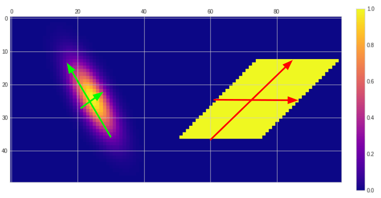
We have a “bag” or gradient values for a bunch of pixels… What if we tried to find a least squares solution to “what is the dominant gradient direction in the neighborhood”?
I am not great at math derivations, but here’s an elegant explanation of the structure tensor. Structure tensor is a Gram matrix of the gradients (vector of “stacked” gradients multiplied by its transpose).
Lots of difficult words, but in essence it’s a very simple 2×2 matrix, where entries are averages of dx^2, dy^2 on the diagonal, and dx*dy on the off diagonal:
Now if we do eigendecomposition of this matrix (which is always possible for a Gram matrix – symmetric, positive semidefinite), we get the following simple closed forms for the eigenvalues:


You might want to normalize the vectors; in the case of the off-diagonal Gram matrix entry of zero, the eigenvectors are simply coordinate system principal axes (1, 0) and (0, 1) (be sure to “sort” them in that case though , same for underdetermined systems, where the ordering doesn’t matter.
Larger eigenvalue and associated eigenvector describe the direction and magnitude of the gradient in dominant direction; it gives us both its orientation and how strong the gradient is in that specific direction.
The second, smaller eigenvalue and perpendicular, second eigenvector gives us information about the gradient in the perpendicular direction.
Together this is really cool, as it allows us to distinguish edges, corners, regions with texture, as well as orientation of edges. In our Handheld Multiframe Super-Resolution paper we used two “derived” properties – strength (simply the square root of the structure tensor dominant eigenvalue) describing how strong is the gradient locally, and coherence computed as . (Note: the original version of the paper had a mistake in the definition of the coherence, a result of late edits for the camera ready version of the paper that we missed. This value has to be between 0 and 1).
Coherence is a bit more uncommon; it describes how much stronger is the dominant direction over the perpendicular one.
By analyzing the eigenvector (any of them is fine, since they are perpendicular), we can get information about the dominant gradient orientation.
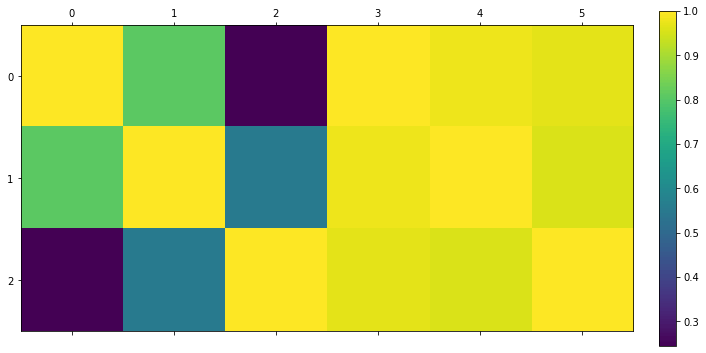
In the case of our test signals that are comprised of simple frequencies, those look as follow (please ignore the behavior on borders/boundaries between images in my quick and dirty implementation):
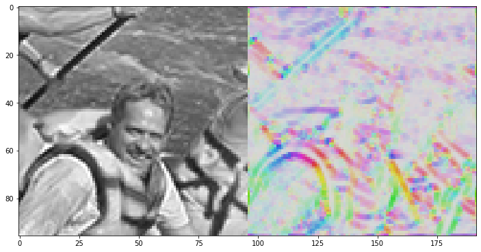
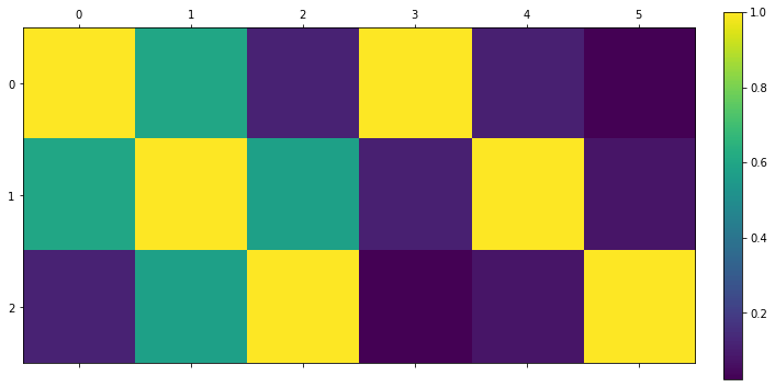
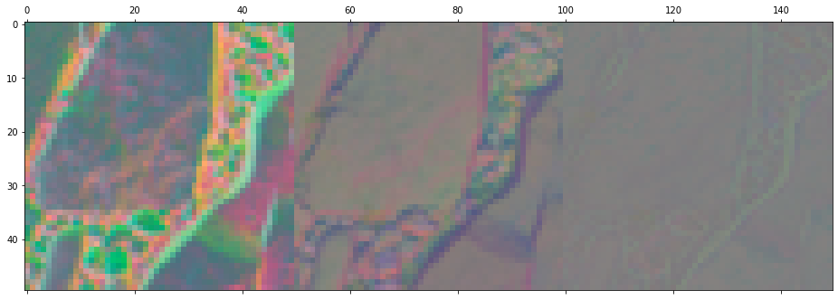
Here’s some other example on an actual image, with a remapping often used for displaying vectors – hue defined by the angle, and saturation by the gradient strength:
Such analysis is important for both edge-aware, non-linear image processing, as well as in computer vision. Structure tensor is a part of Harris corner detector, which used to be probably the most common computer vision question prior to the whole deep learning revolution. 🙂 (Still, if you’re looking for a job in the field even today, I suggest not skipping on such fundamentals as interviewers can still ask for classic approaches to verify how much of the background you understand!)
Fixing rotation
One thing that is worth mentioning is how to “fix” the rotation of structure tensor from diagonal gradients. If you compute the angle through arctan, this is not something you’d care about (just add value to your angle), but in scenarios where you need higher computational efficiency, you don’t want to be doing any inverse trigonometry, and this matters a lot. Luckily, rotating Gram or covariance matrices is super easy! Formula for rotating a covariance matrix is simply . Constructing a rotation matrix by 45 degree from angle formula, we get first:

And then:

(Note: worth double checking my math. But it makes sense that having exactly the same 4 diagonal elements cancels them and suggests a vertical only or diagonal only gradient!)
Frequency analysis
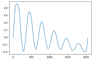
Before I conclude the post, I couldn’t resist looking at comparing the forward differences and central differences from the perspective of signal processing.
It’s probably a bit unorthodox and most people don’t look at it this way, but I couldn’t stop thinking about the disappearing high frequencies; ideal differentiator of continuous signals should have “infinite” frequency response as frequencies go to infinity!
Obviously frequencies can go only up to Nyquist in the discrete domain. But let’s have a look at the frequency response of the forward difference convolution filter and the central difference:

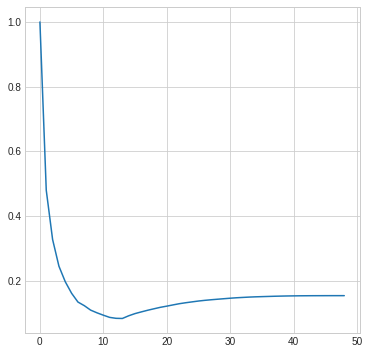
The central difference convolution filter has zero frequency response at Nyquist and seems to match the frequency response worse than a simple forward difference filter with increasing frequencies. This is the “cost” we pay for compensating for the phase shift.
But given this frequency response, it makes sense that a sequence of 1 0 1 0 completely “disappears”, as it is exactly at Nyquist, where the response is zero!
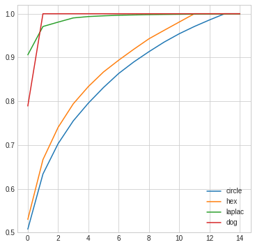
Finally, if we look at higher order / more filter tap gradient approximations, we can see that it definitely improves for most mid-high frequencies, but the behavior when approaching Nyquist is still a problem:

Ok, with 9 taps we get better and better behavior and closer to the differentiator line.
At the same time, the convergence is slow and we won’t be able to recover the exact Nyquist:

This is due to “perfect” resampling having frequency response of 0 at Nyquist. Whether this is a problem or not depends on your use-case. In both photography, as well as computer graphics we get get sequences occurring at perfect Nyquist (from rasterization or sampling photographic signals). Anyway, I highly recommend the diagonal filters which don’t have this issue!
Conclusions
In my post, I only skimmed the surface of the deep topic of grid (image, voxel) gradients, but covered a bunch of related topics and connections:
- I discussed differences between the forward and central differences, how to address some of their problems, and some reasons for the classic Sobel operator.
- I presented a neat “trick” of using diagonal gradients that fixes some of the shortcomings of the alternatives and I’d suggest it to you as the go-to one. Try it out with other signal sources like voxels, or for computing normal maps!
- I mentioned how to robustly compute centered gradients on a 3×3 grid using the diagonal method.
- I briefly touched on the concept of structure tensor, a least squares solution for finding dominant gradient direction on a grid, and how its eigenanalysis provides many more extensions / useful descriptors over just gradients.
- Finally, I played with analyzing frequency response of discrete difference operators and how they compare to theoretical perfect differentiator in signal processing.
As always, I hope that at least some of those points are going to be practically useful in your work, inspire you in your own research, or to do further reading and maybe correct me or engage in discussion in comments on on twitter. 🙂


 real or complex matrix
  is a factorization of the form
  , where
  is an
is an  real or complex
  is an
is an  is an
is an  real or complex unitary matrix. If
  are real


You must be logged in to post a comment.