
This is part one of the whole article. Part two is here.
In this two posts (started as one, but I had to split it to make it more… digestible) I’m going to talk a bit about the white balance. First part will describe what it is, how human white perception works and how both vintage and modern photography used to and currently deals with it and provide perceptually “correct” tones. If you don’t feel very confident about white balance management in lighting, photography and output color spaces – I hope it will provide some interesting new facts.
The second part will focus more on practical application. I will analyze which steps of color and white balance management are missing in many games pipelines, what we ignore and what we used to “hack” in previous generation of renderers and how. I will present some loose ideas on how we can include this knowledge and improve our handling of light temperature.
White color
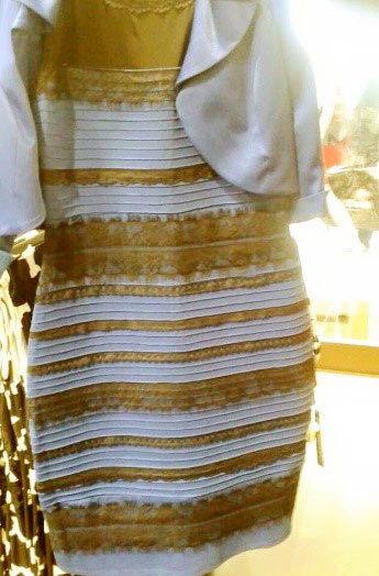
Remember that gold/white and black/blue dress and weirdly vivid discussion about it in the internet?

Source: Tumblr/Swiked
There are already many posts trying to describe what is going on there (lighting conditions, light exposure) and I won’t be going more into it, but wanted to use it as an example – that color that is clearly RGB blue on a picture and when checked with a color picker can be considered white (and to be honest I was one of those gold/white people 😉 ).
Why is it so? The main reason is that in nature there is no single “white” color. As you know, light can have different wavelengths and every wavelength (within range of human perception of ~390-800nm) has some color corresponding to the response of eye.
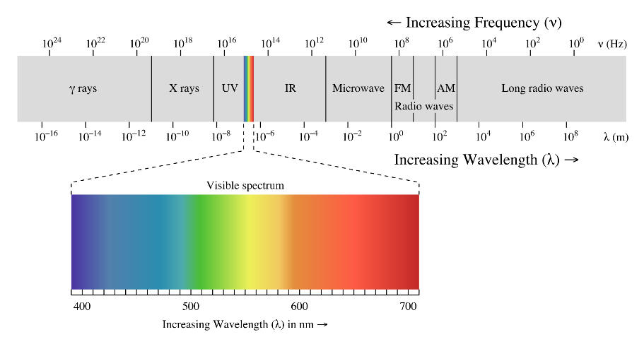
Light wave lengths and visible color. Source: Wikipedia
No white color there… So what defines white? When all eye photoreceptor cones are excited the same way? When camera Bayer-filtered cells generate same electrical output? When all layers of film are exposed?

Fujifilm Provia color layer sensitivity curve, source: Fujifilm
Unfortunately no, it is way more complex and there is no single definition of white (though the last answer – film sensitivity is closest as film is very “defined” medium and with slides /positive process it can be viewed directly).
Usually, white is defined by specific spectra of light sources of certain color temperature. Color temperature and its use in photography and color science is in my opinion quite fascinating concept, as it comes from physics and black body radiation.
Color temperature of a natural (but also artificial) light source is a value assigned to a color perceptually similar to a color emitted by a perfect black body of given temperature. Blackbodies of different temperatures emit a different wavelength spectra and perceptually those spectra will appear different color.

Source: wikipedia
While some cooler blackbodies seem clearly red, range of yellowish-blueish ones (4000-8000K?) can be used to define white color.
Look in your monitor settings, you will find some color temperature setting that most probably (and hopefully – if you work with colors) will show 6500K, a common value for “daylight”.
Ok, so is this 6500K a white color? No… Depends!
I will describe it in a second, but first – where this whole 6500K comes from? Quick google-fu will verify that it is not the actual physical temperature of the sun (which is ~5800K). After passing through the atmosphere, sun perceived temperature gets even colder (Rayleigh scattering), resulting in actually warmer (in artistic terms) colors.
Note: the naming of warm/cold white balance is very confusing, as artistically “warm” colors correspond to “colder” black bodies and color balances! But using “warmer” temperature of a light source (and perceptually colder color) as the white point will “warm up” colors in the scene! This sounds crazy and confusing, but please keep reading – I hope that after both posts it will be easier.
On the other hand, we get the atmospheric in-scattering and perceptually blue skies and sky lighting also contributes to overall light color and intensity. This 6500K is average daylight light temperature during a cloudy, overcast day (after multi-scattering in the sky and clouds) – neither the temperature of the sun or the sky on its own. In my camera settings this color temperature is also referred to as “cloudy” white balance. Naming of white balance settings is not standardized (to my knowledge) and may vary from device to device.
Finally, spectrum of a ~6500K black-body defines so called Illuminant D65, a CIE standardized definition of daylight corresponding to +/- mid European mid day light temperature. What is most important is that this D65 is a standard white color when outputting information in sRGB or REC-709, our standard formats when generating output images for display in the internet or on the HD TV. And this is why you really should make sure that lights in your studio are the same daylight D65 color temperature (and see the next paragraph).
Perception of white
Ok, so I mentioned that 6500K can be white and it depends. What defines it in reality, outside of artificial monitor color spaces?
Eyes are not our primary vision perception device. They are just lens and sensor combination. Our main source of vision and perception is obviously brain. Brain interprets white differently depending on the lighting conditions.
I intuitively think of it as of brain trying to interpret white in terms of actually reflected color, white albedo. Have you ever been in one of old towns (one of things I miss so much about the Europe!) lit by gas-lamps or old, tungsten lamps? Like the one on the perfect masterpiece from Van Gogh:
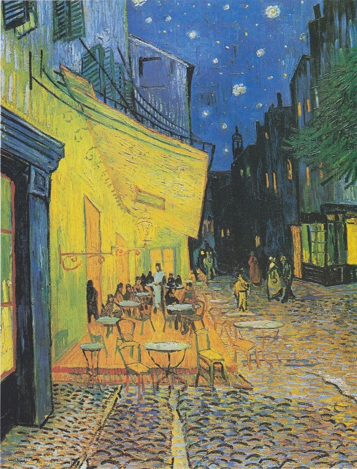
“Cafe Terrace at Night”, Vincent van Gogh
The painting is quite bright, but you can clearly identify a night scene, by seeing yellow lamps and the blue sky. Still, you can see some white(ish) brush strokes in the painting (tables).
Colors are pretty saturated, it is clearly (post)impressionist and stylized, still looks believable. This is how the artist saw and imagined that scene and this is how we accept and recognize it.
What is really fascinating is what happens if you try to take a photo of such scene with the same camera settings as during the day. Would it look like on this photo?
I found a preeeetty old photo (while still in RAW file) in my personal collection in beautiful Spanish Malaga and tried that experiment (note: zero color grading).
Let’s set color temperature to D65! It’s the standard, right?

Hmm, pretty orange and ugly… Especially people skin tones look unnatural and uncanny (unless you enjoy over-the-top color grading of blockbuster Hollywood movies).
Let’s correct it – set the white balance for tungsten (as while I didn’t have a handy spectrograph, I expect those lights to have tungsten – wolfram – filaments 😉 ).
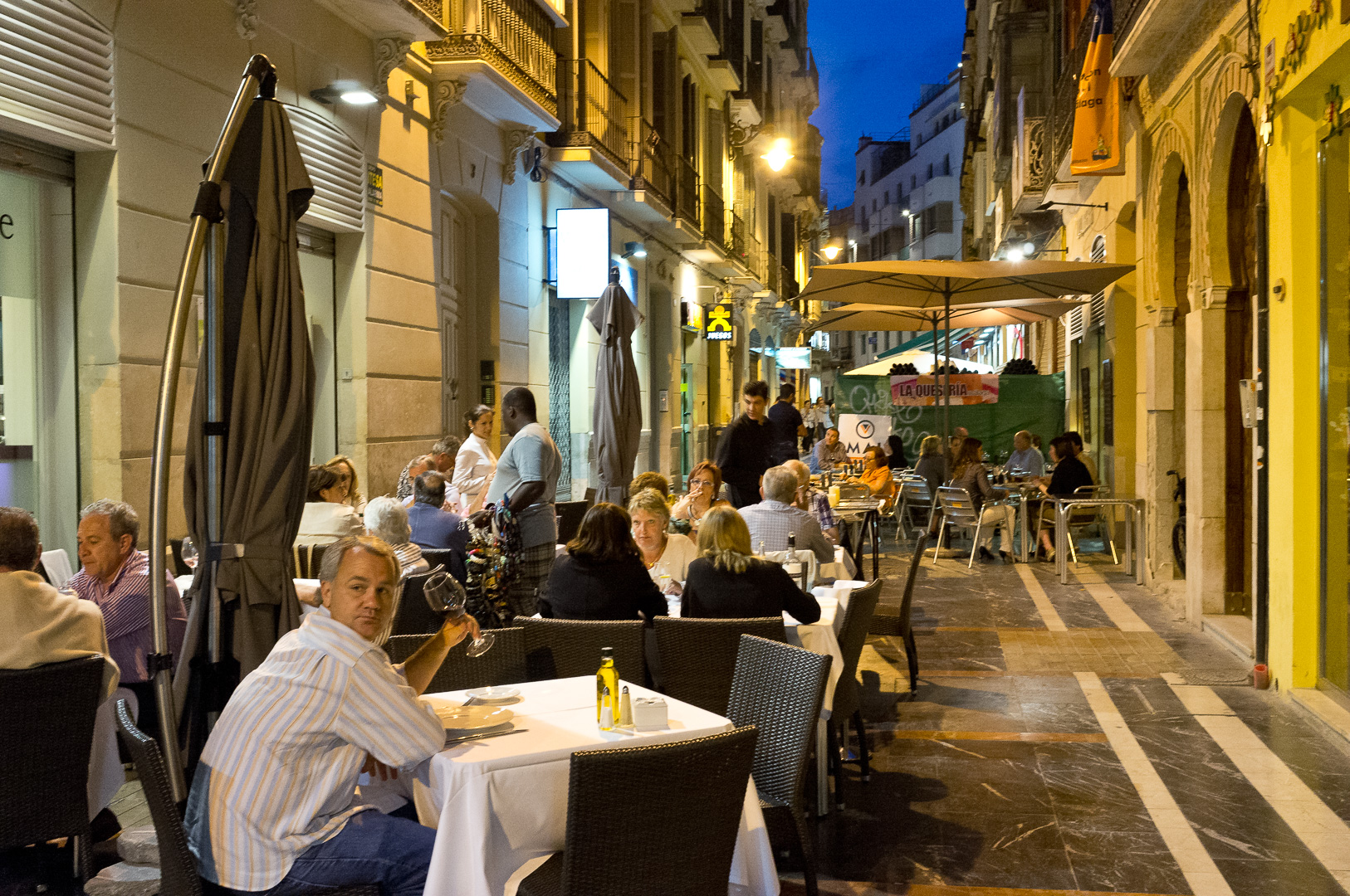
More natural looking and more similar to the master’s painting (except for saturation, composition, artistic value and all that stuff, you know 😉 ).
Similar example (also not very artistically appealing, but even more extreme as there are no billboard lights to neutralize the tungsten – this time from beautiful Valentia), D65 version:

…and after the correction:

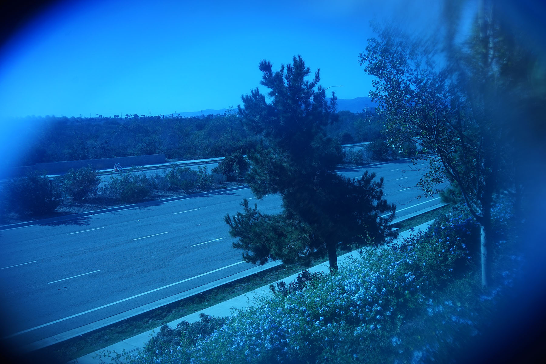
I hope those 2 examples proved how human perception can differ from a photograph in orange lights. But in my collection I found an example of opposite effect – camera exposing scene for daylight at evening when all lighting comes from the sky, resulting in extreme blueish color cast. (btw. this is how it looked straight from camera and showing how poor job it did at auto white balancing – this is from old Nikon D90). As lovely Edinburgh, this time not D65, but ~5300K (no idea why camera would set it this way…):
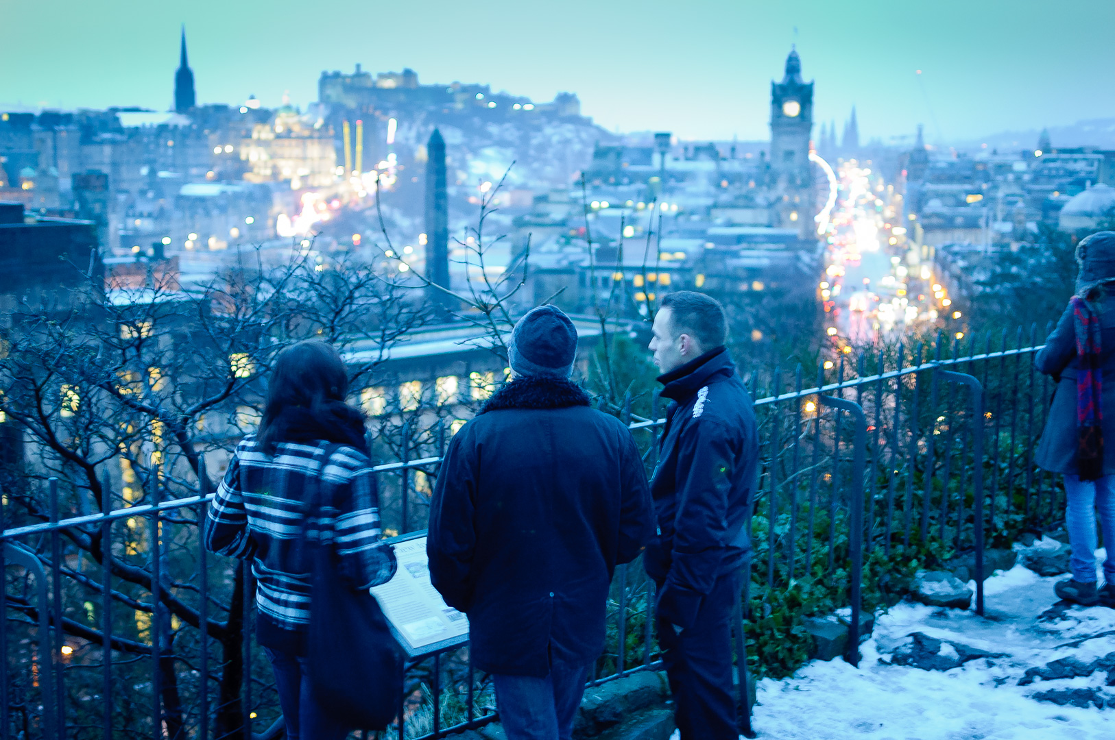
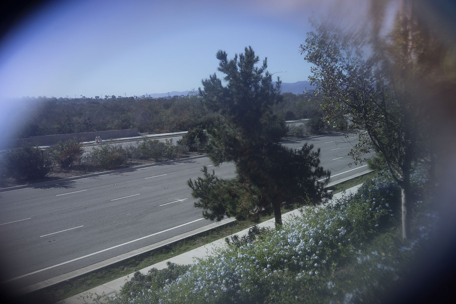
The same photo with corrected white balance (50 000K – insanely high!) looks like this:
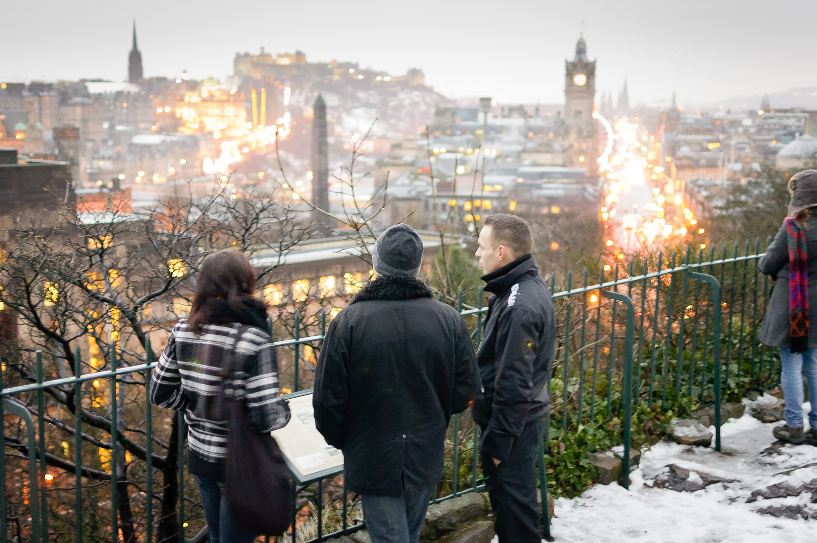
Snow and skin color look much better and more natural. (On the other hand, the photo lost impression of evening darkness and accidental, color-graded cooler winter atmosphere; note that this is trick used in cinematography – filming during the day using white, bright lights and color grading blue to simulate night and evening scenes).
So what is this photo white balance? What does that mean? If you never worked with RAW conversion software or were not digging in camera menus, you could be surprised, but even mobile phone cameras adjust the white balance (on iPhone you can check out Camera+ that allows you to play with various white balance settings).
Small side note – if you have many light sources of different color temperature can result in weird, ugly and un-correctable pictures. Common white flash that completely doesn’t match the scene lighting and makes people look unattractive is an example – and this is why Apple implemented dual LED flashes in their new iPhone built-in cameras, a feature I was really enthusiastic about.
White balance and eye adaptation
White balance defines what color temperature (and tint – for artificial light sources or for the scenes dominated with bounced light color e.g. green bounce from foliage) is expected to be white. It is also the color that your brain expects to be white in given light conditions.
Think of it as of color equivalent of exposure adaptation – eyes and brain slowly adapt to the lighting conditions. Doesn’t matter if they are 25 EV stops apart (so hmm ~33 million times brighter?) – after a while and if you have good eye sight, you will adapt to those new lighting conditions.
In the same manner, your brain knows already light types, knows materials, knows what it was thinking is white and what you expect to be white – and slowly adjusts to this expected white color.
I have an interesting example – swimming googles. Some cheap tinted googles I bought a while ago (work very well if you swim mainly outdoors).
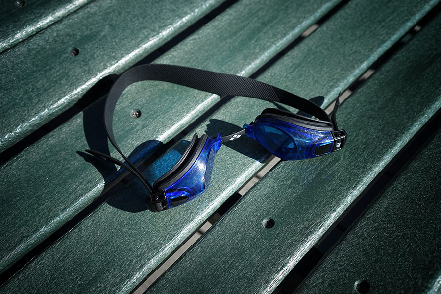
What is really interesting is that at first, after just putting them on, the tint seems extreme. However after 20-30 minutes of swimming, eyesight adapts completely, I no longer notice any tint at all. And after taking them off, everything looks orange / sepia-like and “warm”. 🙂 I tried to reproduce this experiment using my camera, RAW files and some Lightroom / Photoshop.
Day wb and a photo straight through the googles.
Almost-corrected WB (geek side note – notice how edges have different color cast due to more color absorption because of larger optical depth).
I wasn’t able to perfectly correct it, as I run out of the WB scale in the Adobe Lightroom (!). It would be interesting to see if those colors are outside of the camera sensor gamut and even in RAW format, or is it only limitation of the software and UX designers clamping slider to “reasonable”/ usable range.
I tried also as an experiment correcting the WB of a resolved JPEG file (so not RAW sensor data). Results look worse – lots of precision loss and banding. I kind of expected it, but this is worth emphasizing – if you ever do strong white balance corrections, never do them in sRGB / 8bit space, but with as high dynamic range and gamut as possible.
Result of trying to correct WB in Adobe Camera RAW using a JPEG file.
Finally, I wanted to check how properly exposed shot would behave after “taking off the goggles” and simulating the eye adaptation, so using same WB as the one used to correct swimming goggles.
Day WB, same scene, no goggles.
Same scene, same WB like for correcting the goggles tint.
Success! Looks almost exactly same like I perceive the scene after taking them the googles after longer swim. So this crude experiment proves that human white perception is at least similar to the camera white balance correction.
…and this is why I mentioned that your studio lighting conditions should be uniform and match the target daylight temperature / D65 color space. Otherwise if your eyes get adapted to surrounding “warmer” or “colder” color, you will perceive colors on the screen “wrong” and will end up making your images or video game output too warm/cold and wrongly balanced!
White balance and professional photography
I mentioned that most cameras – from your handy mobile phone through point and shoot camera but also up to professional, full-frame ones – have an option for automatically setting the white balance with literally zero user intervention. This is not setting the output color space white balance (sRGB or Adobe RGB, which is more friendly when outputting images not only for monitor display, but also for print), but neutralizing the color temperature of incoming light.
I have to admit I’m not 100% sure how it works (Sony/Canon/Nikon trade secrets?) – definitely seems more sophisticated than calculating average captured color temperature. My guess would be them having some reference db or approximate fitted algorithm that bases on “common” scenarios. Maybe per-scene, maybe only depending on the histogram. But no matter how smart is this algorithm all of those algorithms fail from time to time and you can end up with a photo with a wrong color balance.
This is not a problem when working with RAW files – you can correct them later and interestingly, Adobe software seems to have much better Auto WB than any camera I used so far. But this is definitely not enough for professional goals. You cannot get consistent and coherent results when relying on some heuristic algorithm with not enough data. Professional photography developed some guidelines and process how to do it robustly.
Getting correct white and color balance is quite well established process, but it consists of many steps and components and failure at one point can result in wrong colors. I’m not going to cover here very important topics of having properly calibrated monitors, proper lighting in the studio / room, working in consistent, proper color spaces and color management. I will focus only on usual ways of acquiring source data with properly calibrated colors.
The main difficulty during acquisition part comes from the fact that a photography captures usually reflected (and/or scattered) light. So we are getting results of convolution of the complex lighting environment, BRDF and material properties. Therefore it is difficult to set up what is reference “white” color when green-filtered sensor pixels can get green light because of either green albedo or green bounced lighting. Easy option to solve this equation is to introduce into scene reference objects that have known properties and by measuring their response to the lighting environment, figuring out properties of light, its color and perceptual white.
Sounds complex, but in its simplest variant is just setting “white balance” using color picker on objects that you know are grey or white (as a last resort I end up looking for eye whites or teeth in the photograph 🙂 gives good starting point, even with tired eyes reddish tint).
More professional option is using “professional” reference materials, like grey/white cards, grey diffuse or perfect chrome balls.

Semi-pro black/white/gray cards.
Even better option is to use range of calibrated, known materials. There are commercial products like X-Rite Color Checker that contain printed various known colors and they allow to analyze not only single color temperature/tint (which is obviously over-simplification of the complex light spectrum!), but also more complex, spectral properties. There are programs that allow to create special camera color profiles for given lighting conditions.

Color checker in action.
I mentioned that this is not easy thing to do, because it relies on very good discipline and remembering about many steps.
In theory any time lighting conditions change (either if you change the angle from which you approach your subject or cloud cover or sun moves), you need to re-capture and re-calibrate colors. This can be long, tedious and easy to confuse process… But following such simple guidelines you are definitely able to capture properly calibrated, natural looking objects and colors of albedo, natural skin colors and portraits etc.
White balance before the digital sensor era – film color response
How did color management look like in times of color film photography?
I’ll be honest – I never have worked with it professionally, only for fun, but what was fun for me, didn’t seem like very fun for people who want to achieve perfect, consistent white balance in their prints…
Every film has different color response and specific color cast. There is greenish Velvia, purpleish Portra, brownish-warm Provia, blue-ish Ektar, red-ish Ektachrome…

Contrasty and slightly brownish Provia 400X. My home city of Warsaw and Wola train station graffitis.
Fujifilm Portra 400 – violet all the way! Warsaw botanical garden.
On the other hand, the film response is fixed and quite low dynamic range (actually pretty ok dynamic range for negative film to make prints, but very small for positive/slides). You cannot change the white balance…
What is their white balance btw.? Which color temperature will produce white albedo on a print? Most films used fixed white balance of around ~5000K (direct, warm sunlight – note that it’s not “digital era standard” of ~6500K). There were some specific films for tungsten lights (like Ektachrome 160T balanced for 3200K) and AFAIK some fluorescent-light balanced ones, but that’s it!
This is the reason if you ever shot film more “professionally”, you probably literally had a bag full of colored filters. Warming daylight filters for cloudy days and shooting in shade, purple filters for correcting green, fluorescent lights and blue filters for tungsten lights. Lots of it was trial-and-error with an unknown outcome (until you develop the film and prints!) and also using such filters meant some luminance loss – which with much lower light sensitivities (anything above 100-200 was starting to get grainy…) of film was definitely undesired…
Ok, this wraps up part one! More (real-time) rendering and practical info to come in part two!
Bonus: gold and white, color corrected dress:

Pingback: White balance and physically based rendering pipelines. Part 2 – practical problems. | Bart Wronski
Pingback: Automatic Exposure | Krzysztof Narkowicz
Pingback: Dimensionality reduction for image and texture set compression | Bart Wronski