
Recently, numerous academic papers in the machine learning / computer vision / image processing domains (re)introduce and discuss a “frequency loss function” or “spectral loss” – and while for many it makes sense and nicely improves achieved results, some of them define or use it wrongly.
The basic idea is – instead of comparing pixels of the image, why not compare the images in the frequency domain for a better high frequency preservation?
While some variants of this loss are useful, this particular take and motivation is often wrong.
Unfortunately, current research contains a lot of “try some new idea, produce a few benchmark numbers that seem good, publish, repeat” papers – without going deeper and understanding what’s going on. Beating a benchmark and an intuitive explanation are enough to publish an idea (but most don’t stick around).
Let me try to dispel some myths and go a bit deeper into the so-called “frequency loss”.
Before I dig into details, here’s a rough summary of my recommendations and conclusion of this post:
- Squared difference of image Fourier transforms is pointless and comes from a misunderstanding. It’s the same as a standard L2 loss.
- Difference of amplitudes of Fourier spectrum can be useful, as it provides shift invariance and is more sensitive to blur than to mild noise. On the other hand, on its own it’s useless (by discarding phase, it doesn’t correspond at all to comparing actual images).
- Adding phase differences to the Frequency loss makes it more meaningful image comparisons, but has a “singularity” that makes it not very useful of a metric. It’s a weird, ad hoc remapping…
- A hybrid combination of pixel comparisons (like L2) and frequency amplitude loss combines useful properties of all of the above and can be a desirable tool.
Interested in why? Keep on reading!
Loss functions on images
I’ve touched upon loss functions in my previous machine learning oriented posts (I’ll highlight the separable filter optimization and generating blue noise through optimization, where in both I discuss some properties of a good loss), but for a fast recap – in machine learning, loss function is a “cost” that the optimization process tries to minimize.
Loss functions are designed to capture aspects of the process / function that we want to “improve” or solve.
They can be also used in a non-learning scenario – as simple error metrics.
Here we will have a look at reference error metrics for comparing two images.
Reference means that we have two images – “image a” and “image b” and we’re trying to answer – how similar or different are those two? More importantly, we want to boil down the answer to just a single number. Typically one of the images is our “ground truth” or target.
We just produce a single number describing the total error / difference, so we can’t distinguish if this difference comes from one being blurry, noisy, or a different color.
Most common loss function is a L2 loss – average squared difference:
It has some very nice properties for many math problems (like close form solution, or that it corresponds to statistically meaningful estimates, like with assumption of white Gaussian noise). On the other hand, it’s known that it is also not great for comparing images, as it doesn’t seem to capture human perception – it’s not sensitive to blurriness, but very sensitive to small shifts.
A variant of this loss called PSNR is where we add a logarithm transform:
This makes values more “human readable” as it’s easier to tell that PSNR of 30 is better than 25 and by how much, while 0.0001 vs 0.0007 is not so easy to understand. Generally values of PSNR in the range above 30 are considered to be acceptable, above 36+ very good.
In this post, I will be using simple scipy “ascent” image:

To demonstrate the shortcomings of L2 loss, I have generated 3 variations of the above picture.
One is shifted by 1 pixel to the left/up, one is noisy, and one is blurry:
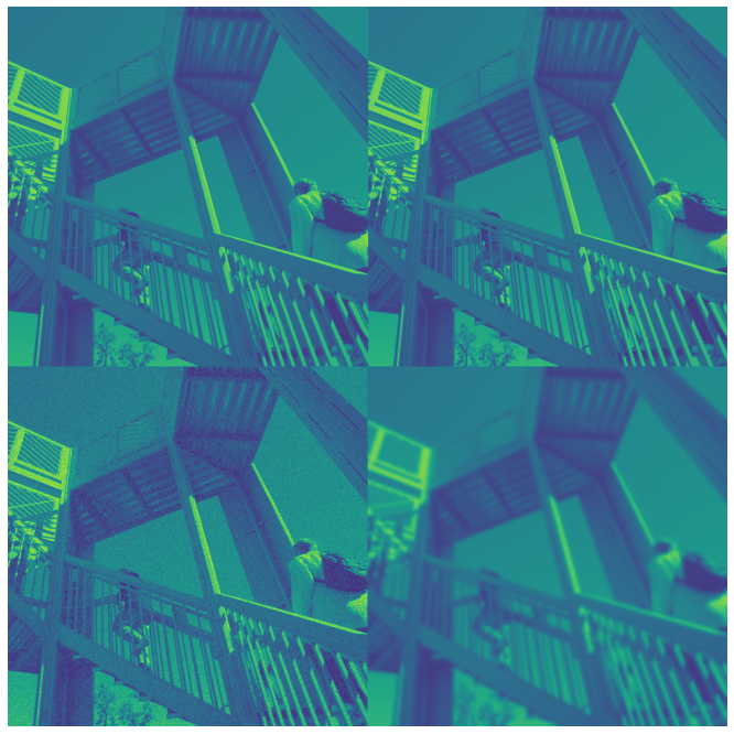
The first two images look completely identical to us (because they are! Just slightly shifted), yet have the same PSNR and L2 error value like a strongly blurry and just mildly noisy one! All of those have a PSNR of ~22.5.
I think on its own this shows why it’s desired to find an alternative to L2 loss / PSNR.
Also it’s worth noting that sensitivity to small shifts is the exactly same phenomenon that causes this “overblurring”. If a few different shifts generate same large error, you can expect their average (aka… blur!) to also generate a similar error:

To combat those shortcomings, many better alternatives were proposed (a very decent recent one is nVidia’s FLIP).
One of the alternatives proposed by researchers is “frequency loss”, which we’ll focus on in this post.
Frequency spectrum
Let’s start with the basics and a recap. Frequency spectrum of a 2D image is a discrete Fourier transform of the image performed to obtain decomposition of the signal into different frequency bands.
I will use here the upper case notation for a Fourier transform:

A 2D Fourier transform can be expressed as such a double sum, or by applying a one dimensional discrete Fourier transform first in one dimension, then in the other one – as multi-dimensional DFT/FFT is separable. Through a 2D DFT, we can obtain a “complex” (as in complex numbers) image of the same size.
Note above that in DFT, every X value is a linear combination of the input pixels x with constant complex weights that depend only on the position – and as such is a linear transform and can be expressed as a gigantic matrix multiply – more on that later.
Every complex number in the DFT image corresponds to a complex phasor; or in simpler terms, amplitude and phase of a sine wave.
If we take a DFT of the image above and visualize complex numbers as red/green color channels, we get an image like this:

This… is not helpful. Much more intuitive is to look at the amplitude of the complex number :

This is how we typically look at periodogram / spectrum images.
Different regions in this representation correspond to different spatial frequencies:
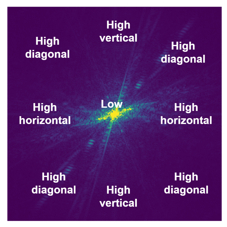
Center corresponds to low frequencies (slowly changing signal), horizontal/vertical axis to pure horizontal/vertical frequencies of increasing period, while corners represent diagonal frequencies.
The analyzed picture has more strong diagonal structures and it’s visible in the frequency spectrum.
Most “natural” images (pictures representing the real world – like photographs, artwork, drawings) have a “decaying” frequency – which means much more of the lower frequencies than the higher ones. In the image above, there are very large almost uniform (or smoothly varying) regions, and a DFT captures this information well.
But taking the amplitude of the complex numbers, we have lost information – projected a complex number onto a single real one. Such an operation (taking the amplitude) is irreversible and lossy, but we can look at what we discarded – phase, which looks kind of random (yet structured):

Relationship between magnitude/amplitude, phase, and the original complex number can be expressed as . Phase is as important, and we’ll get back to it later.
Comparing periodograms vs comparing images
After such an intro, we can analyze the motivation behind using such a transformation for comparing images.
One of the main reasons for the “frequency loss” (we’ll try to clarify this term in a second) to compare images is (hand-waving emerges) “if you use the L2 loss, it’s not sensitive to small variations of high frequencies and textures, and it’s not sensitive at all to blurriness. By directly comparing frequency spectrum content, we can reproduce the exact frequency spectrum, and help alleviate this and make the loss more sensitive to high frequencies”.
Is this intuition true? It depends. Different papers define frequency loss differently. As a first go, I’ll start with the one that is wrong and I have seen in at least two papers – use of the squared difference of complex numbers in the power spectrum:
Here is how average L2 (average squared difference) looks like compared to “normalized” power spectrum (depending on the implementation, some FFT implementations divide by N, some divide by N^2):

They are the same. PSNR is the same as log transform of this squared pseudo-frequency-loss.

Average squared complex spectrum difference is the same as squared image difference.
Squared complex spectrum difference is pointless
Those papers that use a standard squared difference on DFTs and claim it gives some better properties are simply wrong. If there are any improvements in experiments, it’s a result of poor methodology or some hyperparameter tuning, not having validation set etc. Well… 🙂
But why is it the same?
I am not great at proofs and math notation / formalism. So for the ones who like more formal treatment, go see Parseval’s theorem and its proofs. You could also try to derive it yourself from expanding the DFT and Euler’s formula. Parseval’s theorem states:

Just consider x and X as not the image pixels and Fourier coefficients, but pixels and Fourier coefficients of differences – and those two are the same.
(Side note: Parseval’s theorem is super useful when you deal with computing statistics and moments like variance of noise that is non-white / spatially correlated. You can directly compute variance from the power spectrum by simply integrating it.)
But this explanation and staring at lines of maths would not be satisfactory to me, I prefer a more intuitive treatment.
So another take is – DFT transform is a unitary transformation. And L2 norm (squared difference) is unitary transformation invariant. Ok, so far this probably doesn’t sound any more intuitive. Let’s take it apart piece by piece.
First – think of unitary transformation as a complex generalization of a rotation matrix. The DFT matrix (a matrix form of the discrete Fourier transform) can be analyzed using the same linear algebra tools and has many of exactly the same properties like a rotation matrix that you can check – verify that it’s normal, orthogonal etc. 🙂 With just one complication – it does the “rotation” in the complex numbers domain.
When I heard about this perspective of DFT in a matrix form and its properties, it took me a while to conceptualize it (and I still probably don’t fully grasp all of its properties). But it’s very useful to think of DFT as a “weird generalization of the rotation” (I hope more mathematically inclined readers don’t get angry at my very loose use of terminology here 🙂 but that’s my intuitive take!).
Having this perspective, we can look at a squared difference – the L2 norm. This is the same as squared Euclidean distance – which doesn’t depend on the rotations of vectors! You can see it on the following diagram:

On the other hand, some other norms like L1 (“Manhattan distance”) definitely depend on those and change, for example:

By rotating a square, you can get L1 distance between two corners from to 2.
We could look at using loss like this. But instead, we can have a look at a better and luckily more common use of spectral loss – comparing the amplitude (instead of full complex numbers).
Spectrum amplitude difference loss
We can look instead at the difference of squared amplitudes:

This representation is more common and has some interesting properties. Let’s use this loss / error metric to compare the three image distortions above:

Ok, now we can see something more interesting happening!
First of all – no, the shifted value is not missing. Shifting an image has an error of zero, so its negative logarithm is at “infinity”. I considered how to show it on this plot, but decided it’s best left out – yes, it is “infinity”.
This time, we are similarly sensitive to blur, but… not sensitive at all to shifts!
The implication that shifting an image by a pixel (or even 100 or 1000 if your “wrap” the image) gives exactly the same frequency response magnitude and zero difference in amplitudes is very important.
This should make some intuitive sense – the image frequency content is the same; but it’s at a different phase.
Spectrum amplitude is shift invariant for pixel-sized shifts and when not resampling!
This can be a very useful property for some super-resolution like tasks and other inverse problems, where we don’t care about small shifts, or might have some problems in for example image alignment stage and we’d like to be robust to those.
We are also less sensitive to noise. In this context, we can say that we are relatively more sensitive to blurriness. This metric has improved quite a lot the score of the noisy picture as compared to the blurry one – which also seems to be doing +/- what we need.
To get them to comparable score with this new metric, we’d need significantly more noise:

But let’s have a look at the direct consequences of this phase invariance that makes this loss useless on its own…
Phase information is essential
Ok, now let’s use our amplitude loss on the original picture, and this one:
The loss value is… 0. According to the frequency amplitude error metric, they are identical.
Again, we are comparing the picture above with:
Yep, those two pictures have exactly the same spectral content amplitudes, just a different phase. I actually just reset the phase / angle to be all zeros (but you could set it to any random values).
By comparison, standard L2 metric error would indicate a huge error there.
For natural images, the phase is crucial. You cannot just ignore it.
This is in an interesting contrast with audio, where phases don’t matter as much (until you get into non-linearities, add many signals, or have quickly changing spectral content -> transients)
Comparing phase and amplitude?
I saw some papers “sneakily” (not explaining why and what’s going on, nor analyzing!) try to solve it by comparing both amplitude, and a phase and adding them together:
Comparing phases is a bit tedious (as it needs to be “toroidal” comparison, -pi needs to yield the same results and zero loss as pi; I ignored it above), but does it make sense? Kind of?
I propose to look at it this way – comparing a sum of frequency and phase loss is like instead of applying a shortest path between two numbers, summing a path along the diagonal, and the angle difference, which can be considered a wide arc:
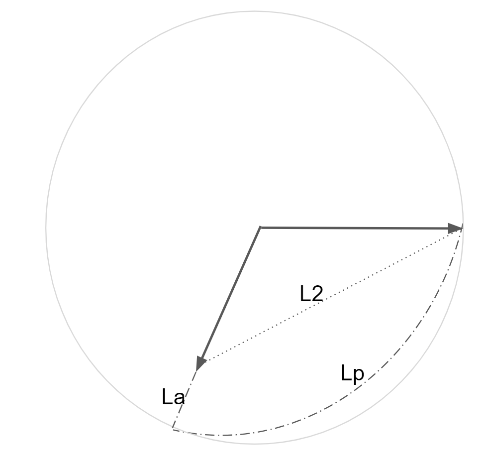
Obviously, relative length of components can be scaled arbitrarily by the coefficient and the effect of phase reduces.
Here’s a visualization of a single frequency with real part of 1, and imaginary of 0 with real/imaginary numbers on the x/y axis, standard L2 loss:
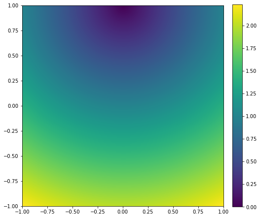
The L2 loss is “radial” – the further we go away from our reference point (0, 1), the error increases radially. Make sure you understand the above plot before going further.
If we looked only at the frequency amplitude difference, it would look like this:

Hopefully this is also intuitive – all vectors with the same magnitude also form a circle of 0 error – whether (1, 0), (0,1), or ( ,
). So we have infinitely many values (corresponding to different phases) that are considered the same and are centered around (0, 0) this time.
And here’s a sum of squared amplitude and angle/phase loss (with the phase slightly downweighted):

So kind of a mix of the above behaviors; but with a nasty singularity around the center – arbitrary small displacements to a (0, 0) vector cause phase to shift and flip arbitrarily…
Imagine a difference between (0, 0.0000001) and (0, -0.0000001) – they have completely opposite phases!
This is a big problem for optimization. In the regions where you get close to zero signal, and the amplitudes are very small, the gradient from the phase is going to be very strong (while irrelevant to what we want to achieve) and discontinuous. And we also lose our original goal – of relying mostly on frequency amplitude similarity of signal.
So does this combined loss make sense? Because of the above reasons, I would recommend against it. I’d argue that papers that propose the above loss and not discuss this behavior are also wrong.
I’ll write my recommendation in the summary, but first let’s have a look at some other frequency spectrum related alternatives that I won’t discuss, but can be an excellent research direction.
Tiled/windowed DFTs/FFTs and wavelets
Generally looking at the whole image and all of the frequencies with global/infinite support (and wrapping!) is rarely desired. Much more interesting mathematical domain was developed for that purpose – all kinds of “wavelets”, localized frequency decomposition. I believe it’s my third blog post where I mention wavelets, but say I don’t know enough about them and I have to defer the reader to literature, so maybe time for me to catch up on their fundamentals… 🙂
A simpler alternative (that doesn’t require a PhD in applied maths) is to look at “localized” DFTs. Chop up the image into small pieces (typically overlapping tiles), apply some window function to prevent discontinuities and weight the influence by the distance, and analyze / compare locally.
This is a very reasonable approach, used often in all kinds of image processing – but also one of the main audio processing building blocks: Short-time Fourier Transform. If you ever looked at audio spectrograms and spectral methods – you have seen those for sure. This is also a useful tool for comparing and operating on images in different contexts, but that’s a topic for yet another future post.
My recommendations
Ok, so going back to the original question – does it make sense to use frequency loss?
Yes, I think so, but in a more limited capacity.
As a first recommendation, I’d say – amplitude if not enough, but don’t compare the phases. You can get a similar result (without the singularity!) by mixing a sum of the squared frequency amplitude and regular, pixel space square loss, something looking like this (but further tuneable):

This is how this loss shape looks like:

With such a formulation, we can compare all the three original image distortion cases:

This way, we can obtain:
- Slightly more sensitivity to blur than to noise as compared to standard L2,
- Some shift invariance for minor shifts,
- Robustness to major shifts – as L2 will dominate,
- Similarly being robust to completely scrambled phases,
- Smooth gradient and no singularities.
Note that I’m not comparing it with SSIM, LPIPS, FLIP, or one of numerous other good “perceptual” losses and will not give any recommendation about those – use of loss and error metric is heavily application specific!
But in a machine learning scenario, in the simplest case where you’d like to improve L2 – add some shift invariance, and care about preserving general spectral content – for example for preserving textures in a GAN training scenario or for computer vision tasks where registration might be imperfect – it’s a useful simple tool to consider.
I would like to acknowledge my colleague Jon Barron with whom I discussed those topics on a few different occasions and who also noticed some of wrong uses of “frequency loss” (as in squared DFT difference) in some recent computer vision papers.

Great article, thanks! I had an idea of using spectral loss in a denoising model, like an autoencoder. I haven’t got that good results yet, but do you think this approach would help with keeping the high-frequency content of an image intact?
Yes, can definitely work in practice. One thing to keep in mind – you always sacrifice something. So if you add a loss on high frequencies, the other parts of your loss are going to get worse. So for example, the model will start generating more noise.
There is no free lunch. 🙂
Yeah, that is exactly what I’m seeing right now 🙂 The model starts to generate periodic noise even when limiting the spectral loss by a quite large factor. But hopefully experimenting will lead to something interesting one day 😀
Thanks for a great article!
However, I don’t fully understand loss plots in the “Comparing phase and amplitude?” section.
Am I correct that you start with 1+0i as ground truth and [-1, 1] + [-1, 1]i as test samples? And then you calculate spectral loss meaning that you apply Fourier transform to these complex numbers?
Is it representative then? Typically we start with real numbers and get complex numbers after Fourier transform.
By comparing phase and amplitude I mean starting with real numbers, getting complex numbers, and then independently comparing the abs(z) and arg(z). Which some papers do and I do not recommend! 🙂
Thanks, I see it. But I don’t really understand which vales are compares by all of these different loss functions.
So in case of L2 loss you have a real-valued sine (or cosine) with some frequency and 0 phase and you compare it to all the sine (or cosine) waves whose corresponding complex values after applying Fourier transform have real and imaginary values in range [-1; 1]?
In other words x and y axis correspond to real and imaginary parts of complex numbers that are obtained from Fourier transform over some sine (or cosine) wave? And color is the value of loss function?
If so, then L2 loss is actually L2 loss in the frequency domain. And proposed plot of frequency domain loss is in the frequency domain of frequency domain of the time domain?? 😨
People just take a DFT of a 2D image and this is what I display here. x and y don’t correspond to real/imaginary components, but 2D frequencies. In some figures I display the magnitude, in some phase.
Yes, but in your article you also show something different and my question was about that:
“Here’s a visualization of a single frequency with real part of 1, and imaginary of 0 with real/imaginary numbers on the x/y axis, standard L2 loss:”
The input data here seems to be something different than 2D image
This is value of the loss and the difference for a single complex frequency band. The choice of (1, 0) is completely arbitrary.
Hi,
Great article. I’ve tried your method on nuclear medicine images and it seems to work. I was wondering if you knew of any peer reviewed articles that demonstrate this method. Thanks.
hi, you seem to completely disregard modeling phase and magnitude implicitly using the real and imaginary parts separately. Both of these can be modeled as real numbers which makes the the inversion lossless, check this paper for more info
https://arxiv.org/pdf/1912.02591.pdf
This makes it possible to take the real and imag parts of a 2D fft and do the same as opposed to STFT in the paper above.
Hi Kevin, thanks for your comment, I will check the listed paper (btw. a small nitpick – when linking arXiv, I always ask people to link to the abs page! More mobile and bookmarking friendly 🙂 ), and from just your comment I seem to agree.
My point was to comment on a common practice in computer vision papers and explain how with an L2 loss, it’s actually equivalent and a bit pointless (unitary transform) and partially debunking it. I just took it further to show how with different weighting and balancing, it can achieve what they aimed to do (caring about the preservation of frequency content without introducing artifacts).